Home Centre: Digital transformation,
from atoms to brilliance
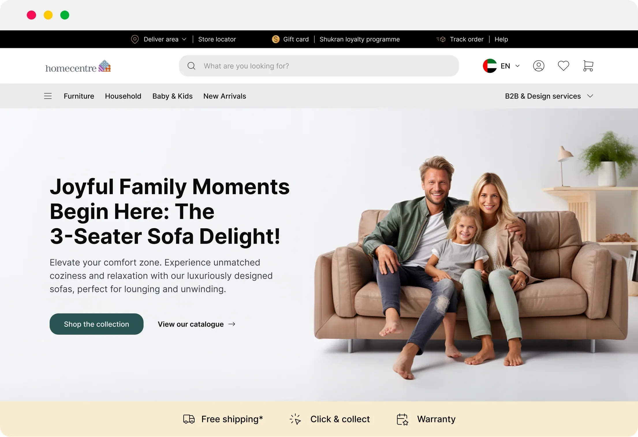
Home Centre is a well-known home furnishing and décor retail brand that operates in various countries, including Dubai and the United Arab Emirates (UAE). Home Centre is part of the Landmark Group, a diversified conglomerate with a significant presence in the Middle East, India, Africa, and other regions.
1. Problem
Customer feedback demands an urgent design upgrade
across platforms
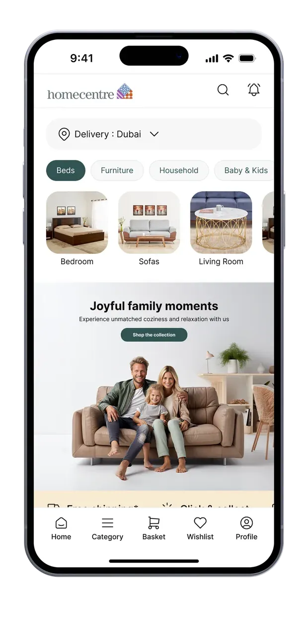
Customer data and feedback clearly revealed that both the Home Centre app and website
fall short in terms of design quality and urgently require a visual transformation. Moreover,
I observed numerous design discrepancies across various platforms.
1.1 – Competitor analysis
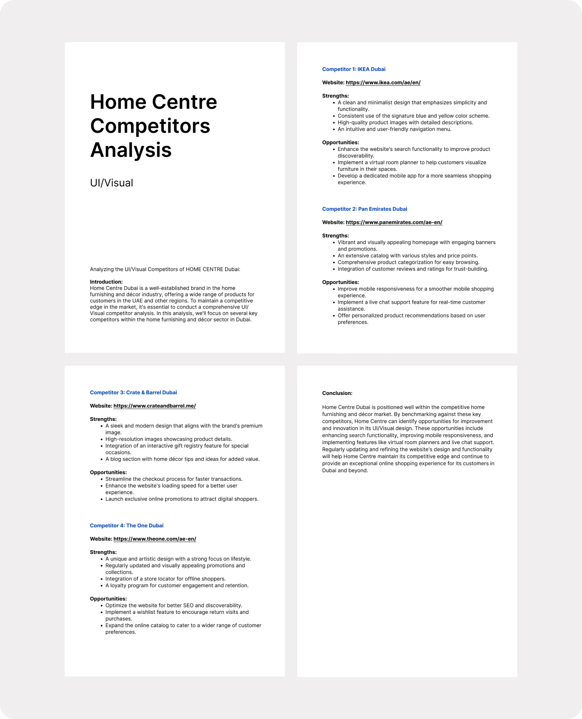
Did a UI/visual competitor analysis for Home Centre, Dubai, UAE.
 IKEA – Dubai
- PAN Emirates – Dubai
- Crate & Barrel – Dubai
- The One – Dubai
1.2 – Got the answer to “Why?”
Why did Home Centre’s existing product fail to make an impact on digital experience?
Design
inconsistencies
across platforms.Digital products
are low-grade in
terms of design.Missing out
on emotional
connections.
2. Solution
Streamline user interfaces
Responsive web, app design and design systems. Create and maintain scalable, cohesive, and user-friendly UIs by starting with the smallest, well-defined building blocks and gradually assembling them into a cohesive whole.
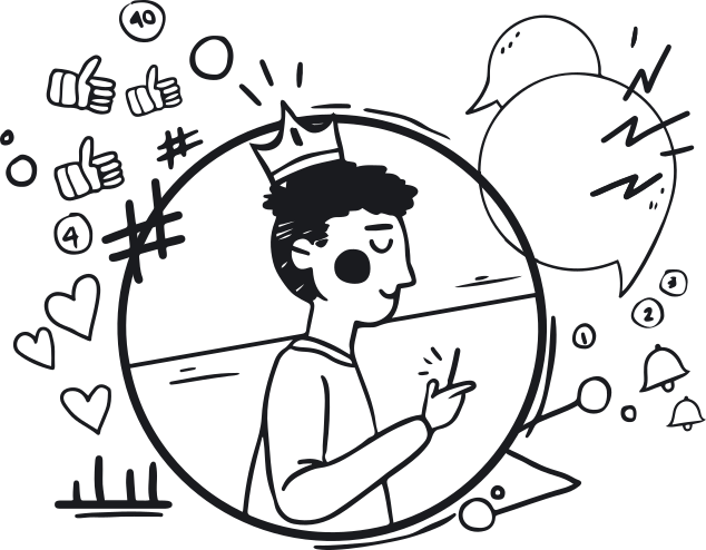
2.1 – Adding emotional connections
Emotions play a significant role in how people perceive and interact with products and brands. By designing with emotion in mind, you can create a deeper, more meaningful connection between our brand and our customers. This emotional connection can
lead to brand loyalty and repeat business.
2.1.1 Enhanced user experience
Emotionally driven design can enhance the overall user experience. When customers feel a positive emotional connection to our brand, they are more likely to enjoy the process of exploring our products, leading to increased engagement and longer time spent on our website or in our store.
2.1.2 Influencing purchase decisions
Emotions can heavily influence purchasing decisions. Design elements that evoke positive emotions, such as comfort, happiness, or security, can help customers feel more confident and satisfied with their buying choices.
2.1.3 Creating aspirational spaces
Home furnishing brands often sell products that contribute to the creation of living spaces. Designing with emotion can help customers visualize how our products can improve their homes and lifestyles, turning their aspirations into reality.
2.1.4 Strengthening brand identity
Emotionally driven design can reinforce our brand’s identity and values. For example, a brand that focuses on sustainability may use design elements that evoke feelings of responsibility and environmental consciousness.
2.1.5 Differentiating from competitors
Emotional design can set our home furnishing brand apart from competitors. When customers experience an emotional connection with our brand, they are less likely to view our products as interchangeable with those of our competitors.
2.1.6 User engagement and sharing
Emotionally appealing design can encourage users to engage with our brand on social media, share their positive experiences, and become brand advocates. This can lead to organic growth and increased visibility.
3. Visual identity
3.1 – Design tokens
A comprehensive and centralized approach to design that ensures consistency, scalability, and efficiency in the creation of design assets. It includes a variety of components, such as typography, color palettes, icons, imagery, layout grids, and user interface (UI) components. It also includes design principles, such as accessibility, usability, and brand identity, which guide the creation of new design elements.
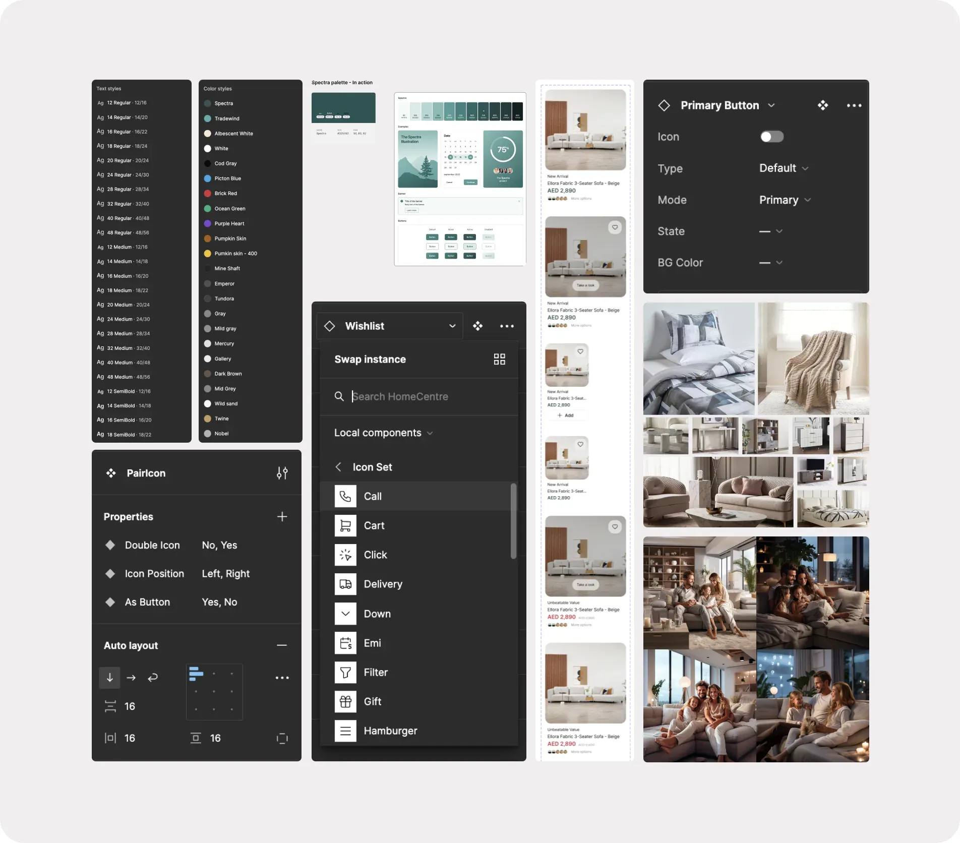
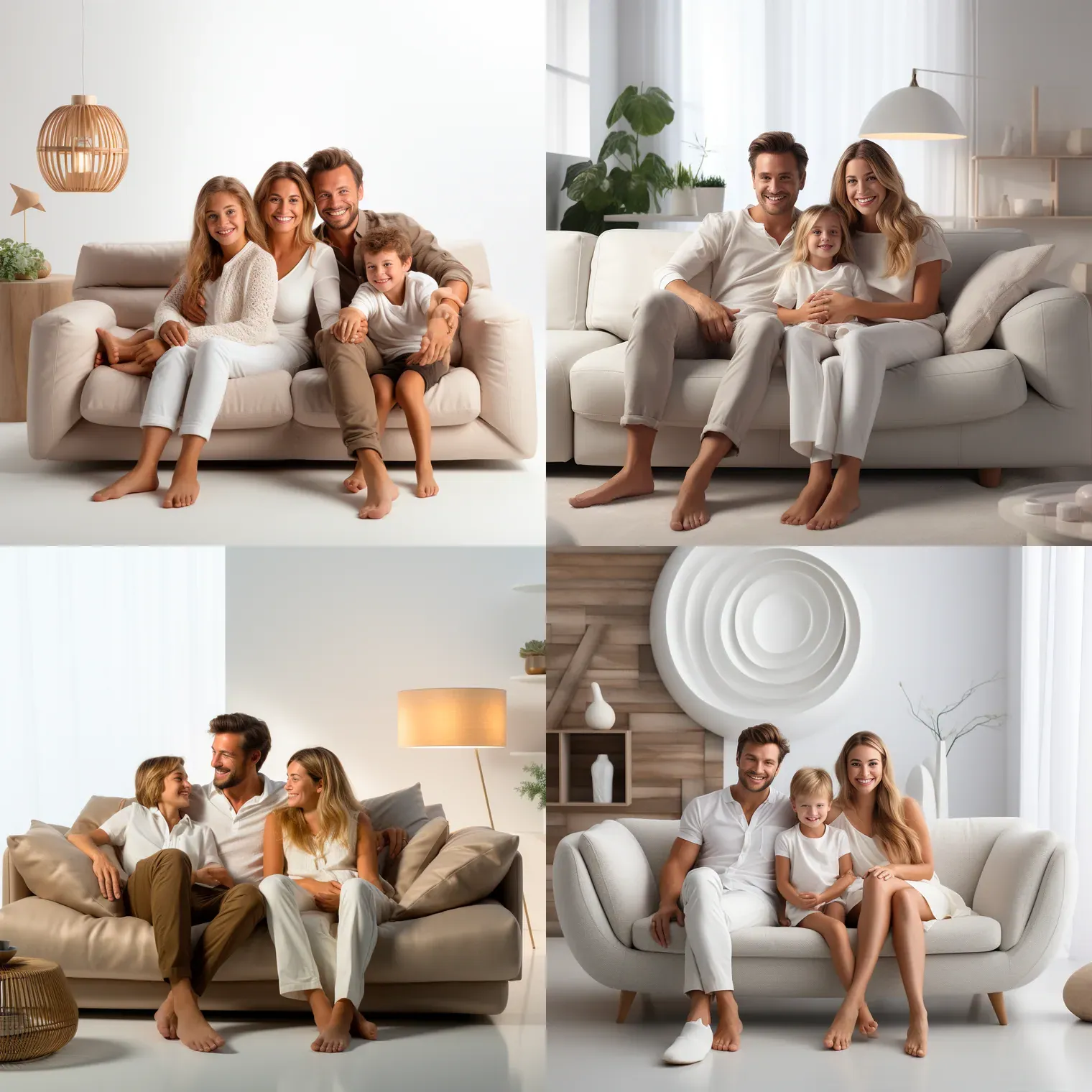
Text styles from 12 to 48px in Regular, Medium and SemiBold, named color styles such as Spectra, Tradewind and Albescent White, the Spectra palette applied to UI examples and button states, product-card variants for a 3-seater sofa, component properties for Primary Button and PairIcon, an icon-set swap menu, and furniture and family lifestyle photos.
Logo

Typography
Home Centre follows the “Inter” font family for typographical representation.
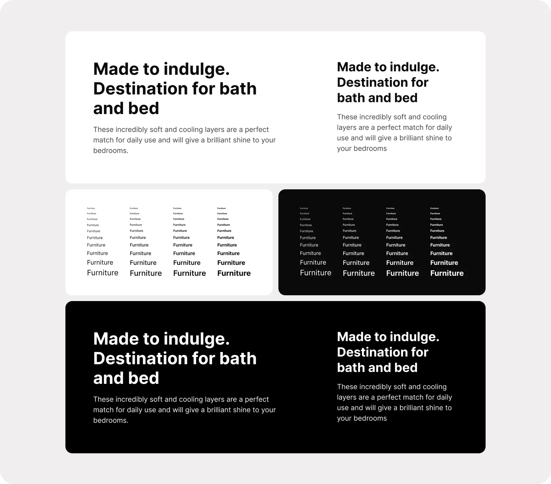
The headline “Made to indulge. Destination for bath and bed” with body copy at desktop and mobile sizes on white and on black, and the word “Furniture” in a ramp of sizes across four weights on light and dark backgrounds.
Using the Inter font for typography in UI design offers several advantages and benefits:
- Readability:
- Inter is designed with legibility and readability in mind. Its open and balanced letterforms make it easy to read in both digital and print formats, ensuring that users can consume content comfortably.
- Consistency:
- Inter offers consistent letter spacing and line heights, which is important for maintaining a harmonious and balanced design across different elements of a UI. This consistency contributes to a polished and professional appearance.
- Accessibility:
- Inter’s clear and well-defined letterforms can enhance accessibility for users with visual impairments. It meets the requirements for accessibility standards, ensuring that text is legible for all users.
- Web Optimization:
- Inter is optimized for web use, meaning it loads quickly and renders well in web browsers. This can contribute to faster page loading times and a better user experience.
- Wide Range of Weights and Styles:
- Inter offers a variety of weights (from thin to bold) and styles (normal, italic) that allow for flexibility in design. You can use different weights to create visual hierarchy and emphasize key content.
- Excellent Multilingual Support:
- Inter supports a wide range of languages and character sets, making it suitable for international applications.
- Modern Aesthetic:
- Inter features a contemporary and modern design aesthetic, which can make your UI design feel fresh and up to date. Also, it achieves a clean and minimalist look.
- Free and Open Source:
- Inter is an open-source font, which means it can be freely used, modified, and distributed. This makes it an attractive option for brands to avoid licensing costs as an add-on expense.
Color
Primary | Secondary | Neutral
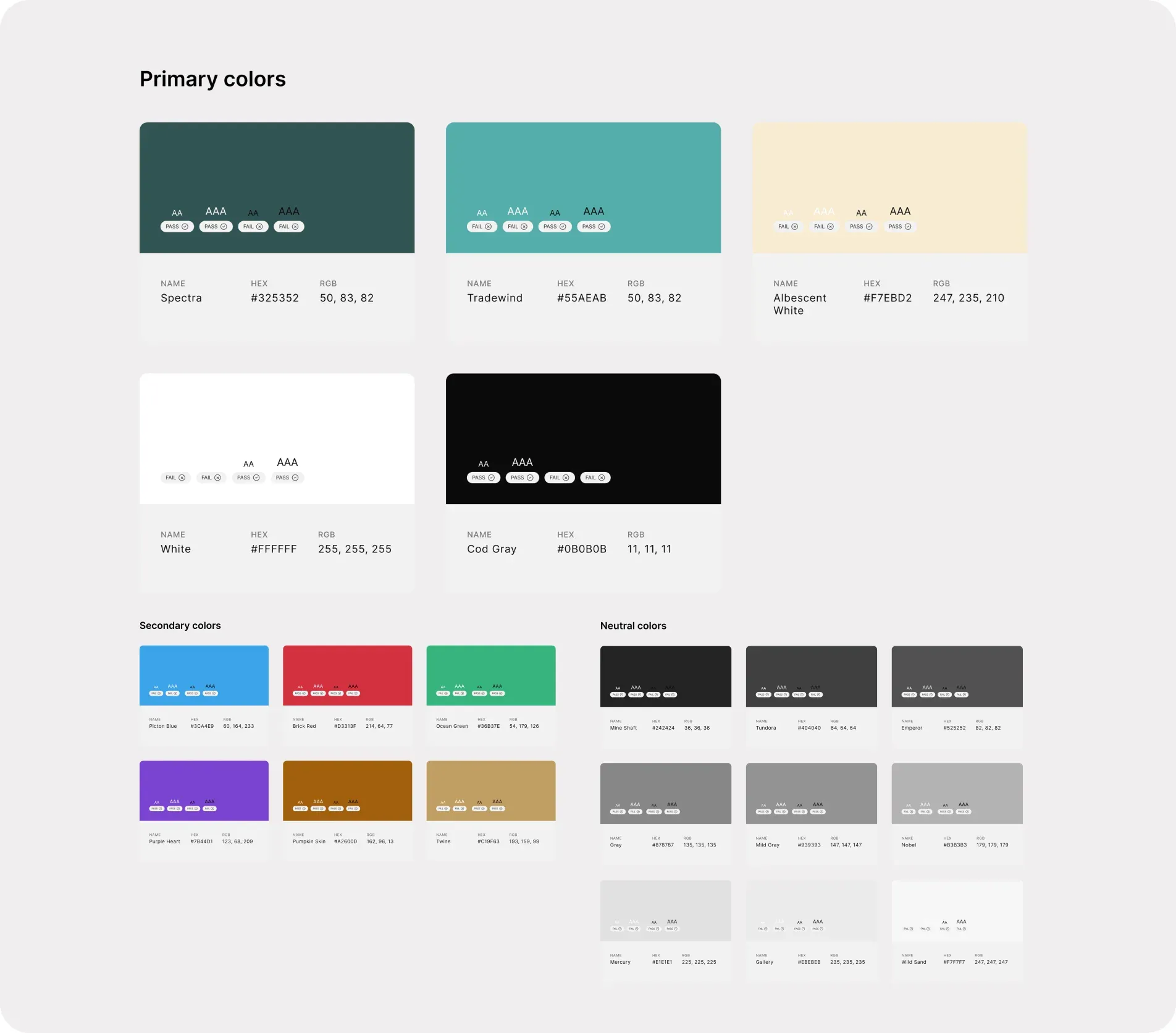
Primary colors Spectra #325352, Tradewind #55AEAB, Albescent White #F7EBD2, White #FFFFFF and Cod Gray #0B0B0B with AA and AAA contrast results, six secondary colors from Picton Blue to Twine, and nine neutral grays from Mine Shaft to Wild Sand.
Sequential color palette
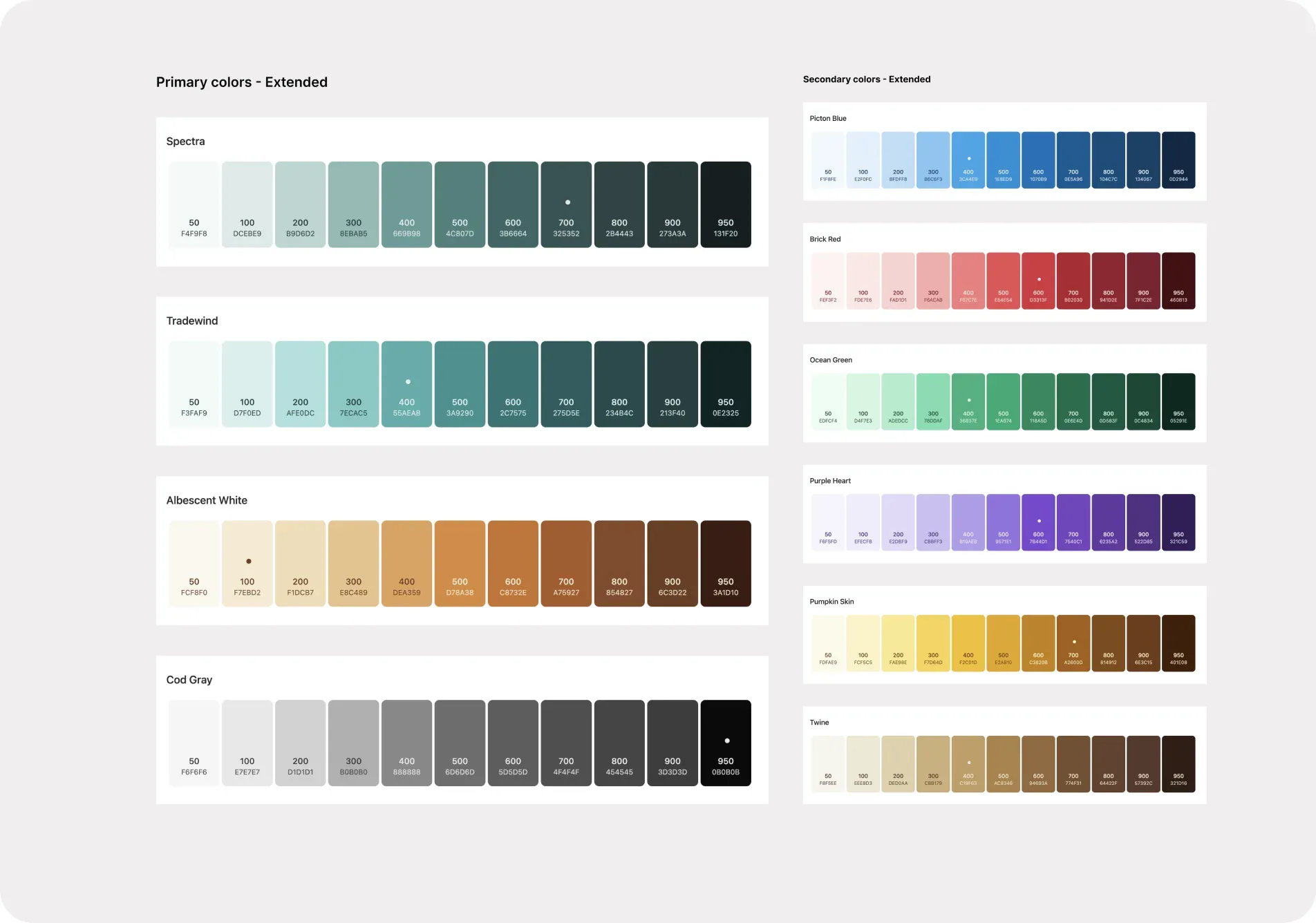
Spectra, Tradewind, Albescent White and Cod Gray for the primary colors, and Picton Blue, Brick Red, Ocean Green, Purple Heart, Pumpkin Skin and Twine for the secondary colors, with each base shade marked.
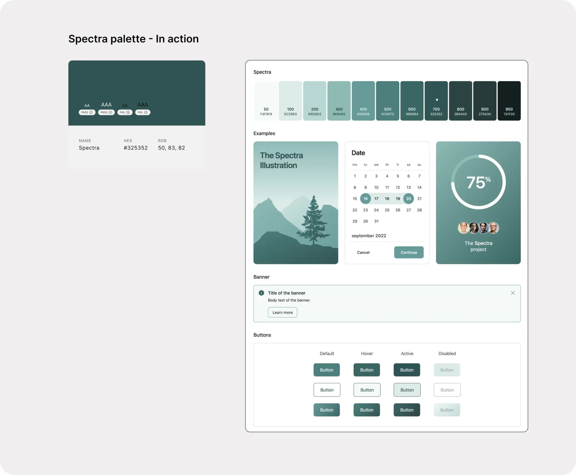
Usage of dark green (Spectra) in UI design can have several advantages, and its effectiveness largely depends on the context and the overall design goals.
- Contrast and Readability:
- Dark green (Spectra) can serve as a strong background color, providing excellent contrast with lighter text and elements. This makes it a suitable choice for text-heavy interfaces or content-focused designs.
- Elegance and Sophistication:
- Dark green (Spectra), when used appropriately, can convey a sense of luxury, sophistication, and richness. It can be an excellent choice for premium or high-end brands.
- Versatility:
- Dark green can be paired with a wide range of colors, both complementary and contrasting, allowing for creative and flexible design options. It can work well with gold, white, cream, or even vibrant accent colors.
- Reduced Eye Strain:
- In low-light or nighttime settings, dark green backgrounds with lighter text can reduce eye strain compared to bright white backgrounds, making it more comfortable for users.
- Natural and Calming:
- Dark green (Spectra) shows the feelings of calmness, tranquility, and relaxation. It can create a soothing and inviting atmosphere in a user interface. It can boost user engagement and interaction with the product.
Spectra on UI – example
Icon
Icon usage across different brand touchpoints from marketing to website to product.

Menu, chevrons, plus, minus, share, payment calendar, store, phone, delivery truck, event calendar, tap, cash, filter, notification bell, sort, express delivery, coupon, profile, search, wishlist heart, home, arrows, cart, location pin and gift.
Why stroke icons:
- Clarity and simplicity
- Scalability
- Reduced visual noise
- Cross-platform compatibility
- Future-proofing
- Adaptability to color schemes
- Accessibility
- Faster load times
- Reduced cognitive load
Imagery
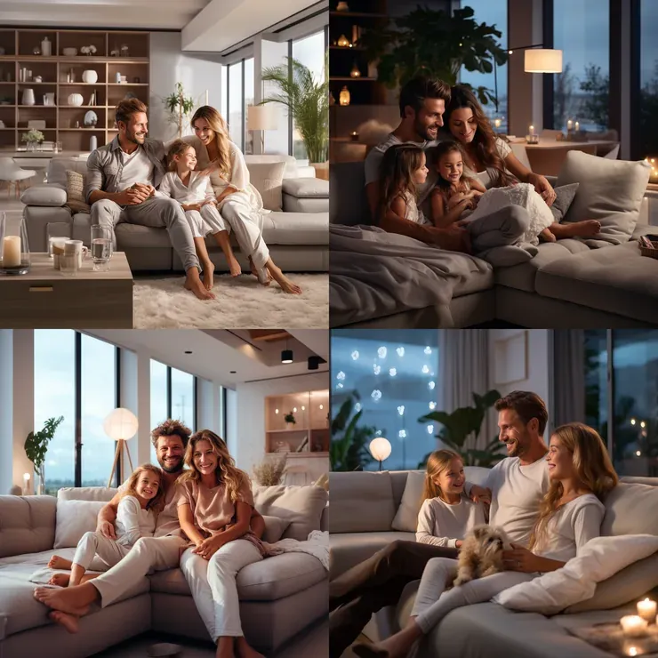
Product photography + Persona (emotional connect)
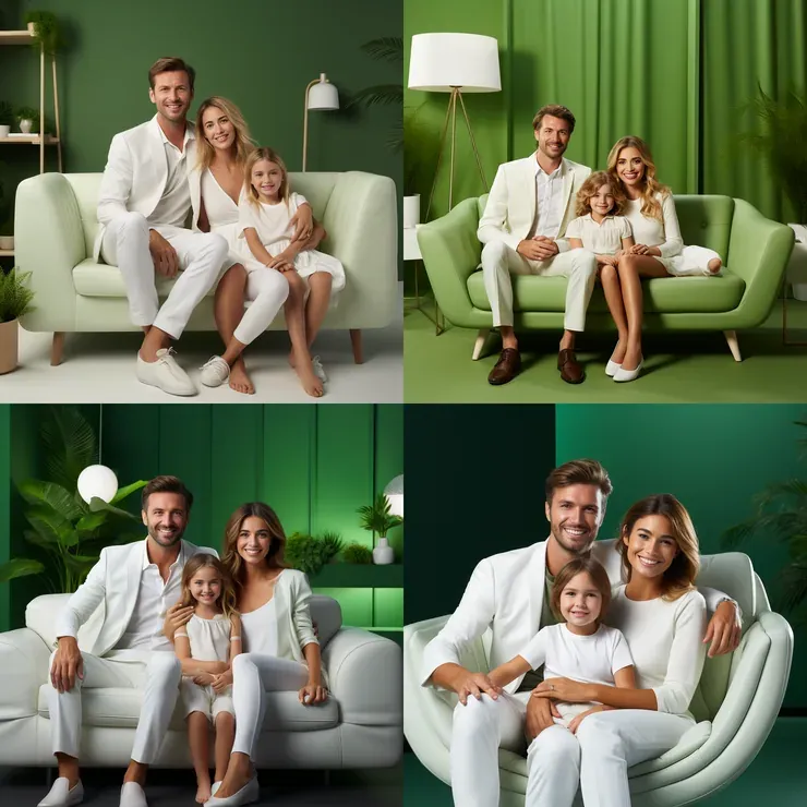
Why persona-based imagery:
- Enhanced user experience
- Influencing purchase decisions
- Creating aspirational spaces
- Strengthening brand identity
- Differentiating from competitors
- User engagement and sharing
3.2 – Atomic design system
Atomic design methodology – for designing and building user interfaces by breaking down the design into its fundamental building blocks, or atoms, and gradually combining them into more complex components and templates. It’s a powerful methodology for designing and building user interfaces that are consistent, scalable, flexible, collaborative, and accessible.
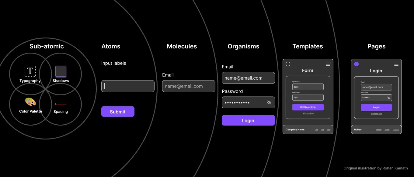
Sub-atomic particles (typography, shadows, color palette, spacing) build atoms (input label, text field, Submit button), then molecules (an email field), organisms (a login form), templates (a form wireframe) and pages (the finished login screen). Original illustration by Rohan Kamath.
Sub-atomic particles
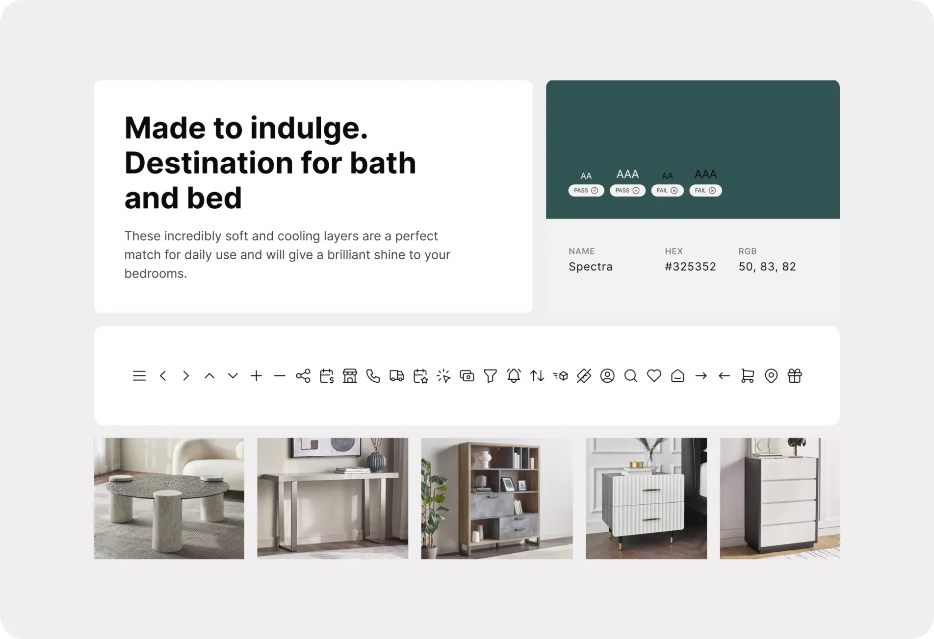
A type specimen card reading “Made to indulge. Destination for bath and bed”, the Spectra color swatch (#325352, RGB 50, 83, 82) with AA and AAA contrast results, a row of stroke icons and five furniture product photos.
Atoms
Molecules
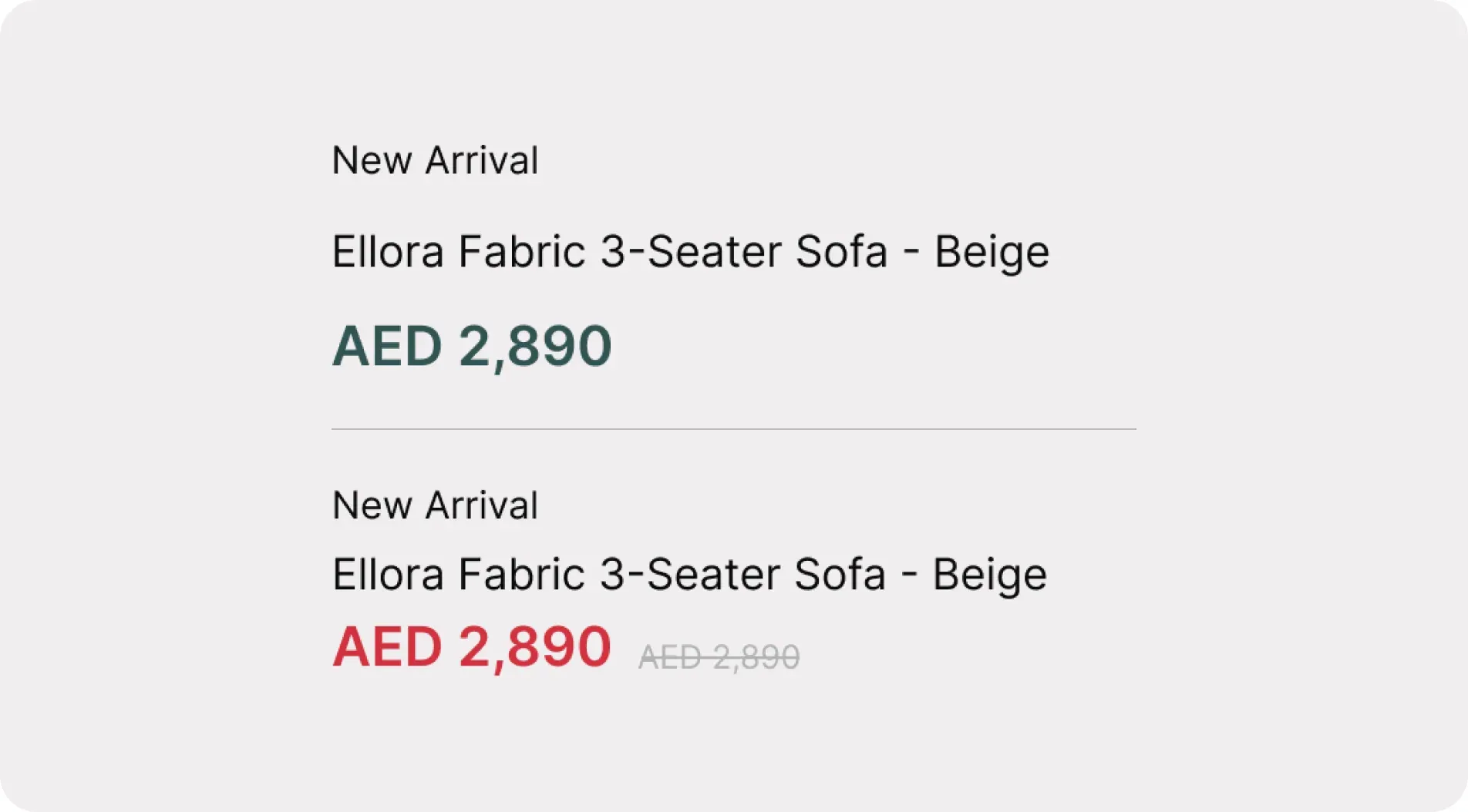
Organisms
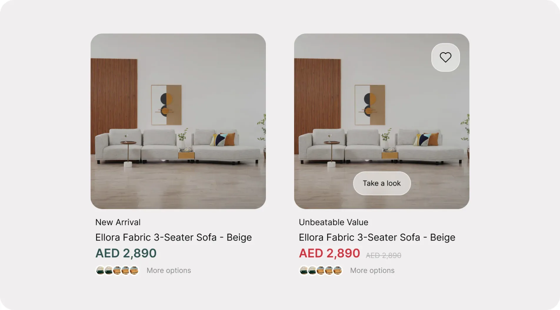
Templates
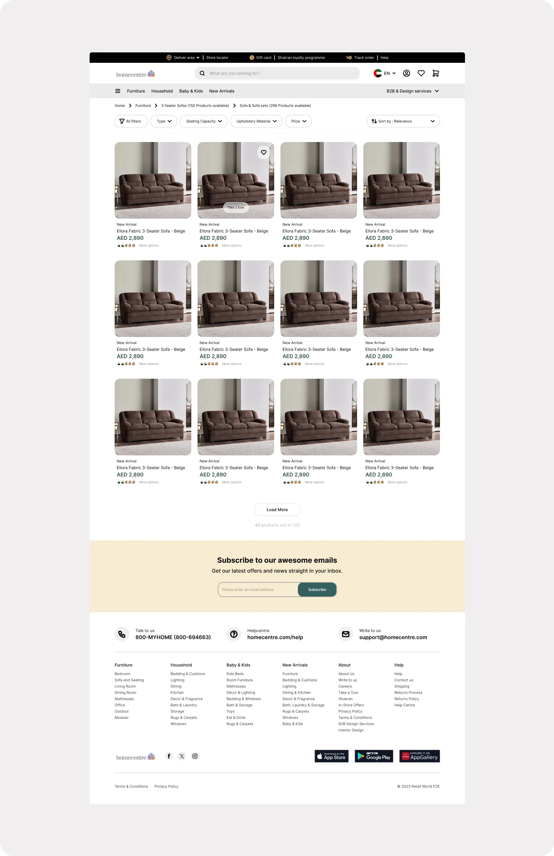
Pages
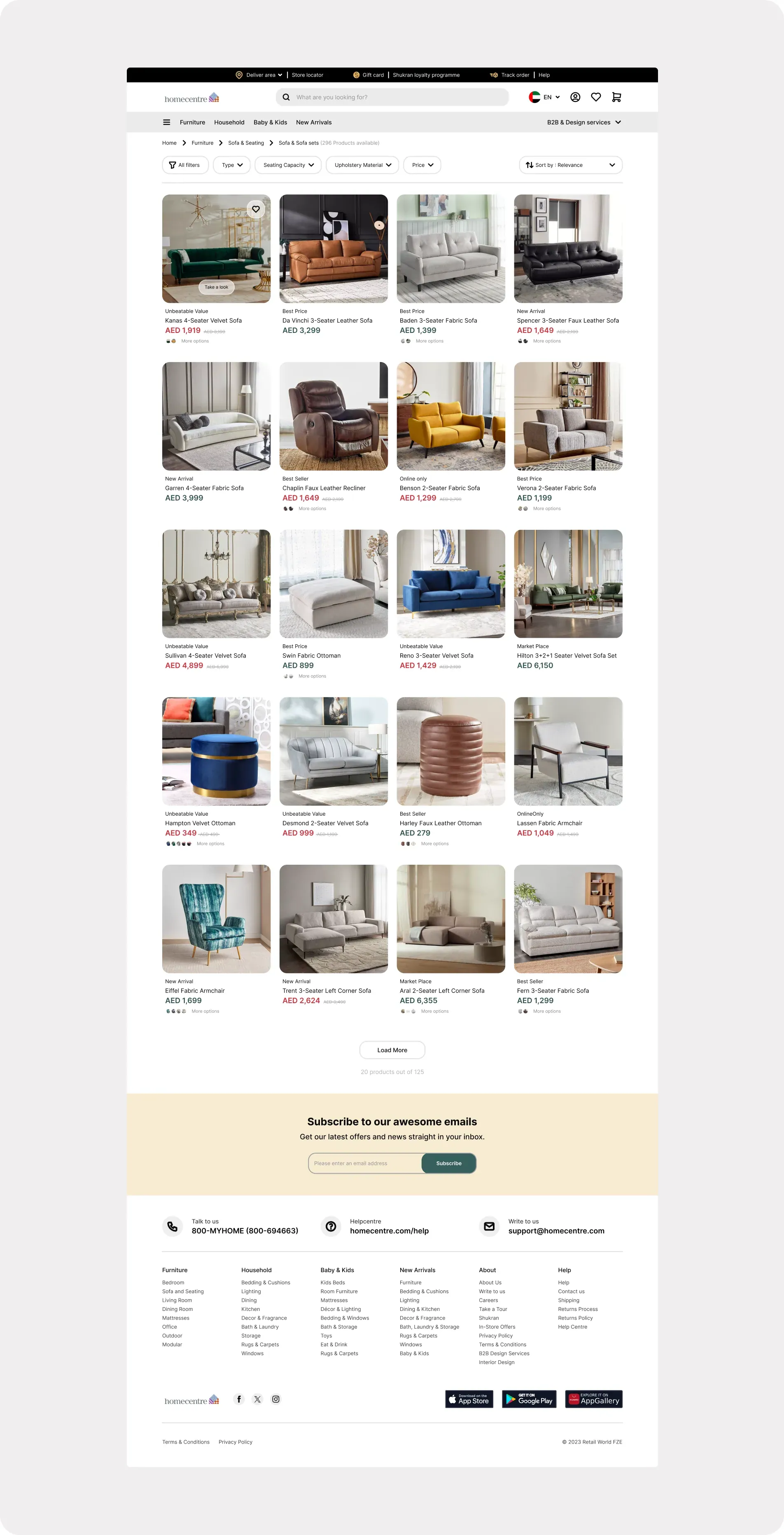
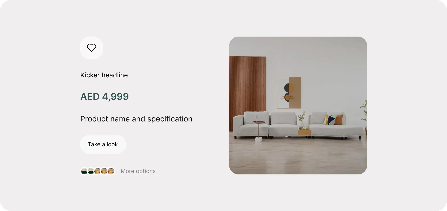
A Home Centre sofa listing page on desktop with search and categories in the header, breadcrumbs, a filter and sort bar, a four-column grid of 20 sofa, armchair and ottoman cards with AED prices, a Load More button, an email sign-up banner and the footer.
3.3 – Web and app screens
Kindly go through the following page (Final design) to explore the final web and app
screen designs.
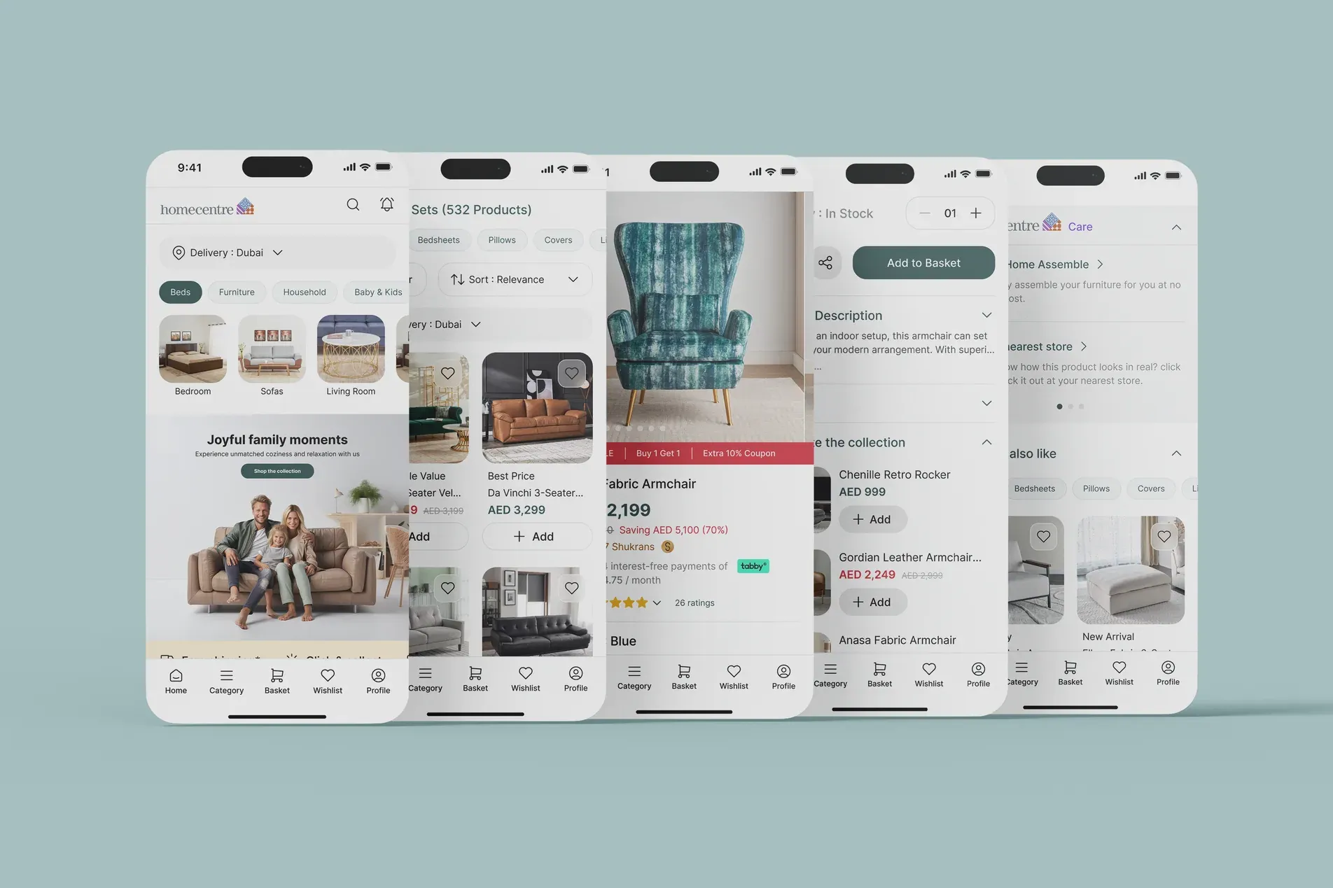
The home screen with category shortcuts and a family sofa banner, a sofa listing, the Eiffel Fabric Armchair product page, its description with Add to Basket, and Home Centre Care with recommendations.
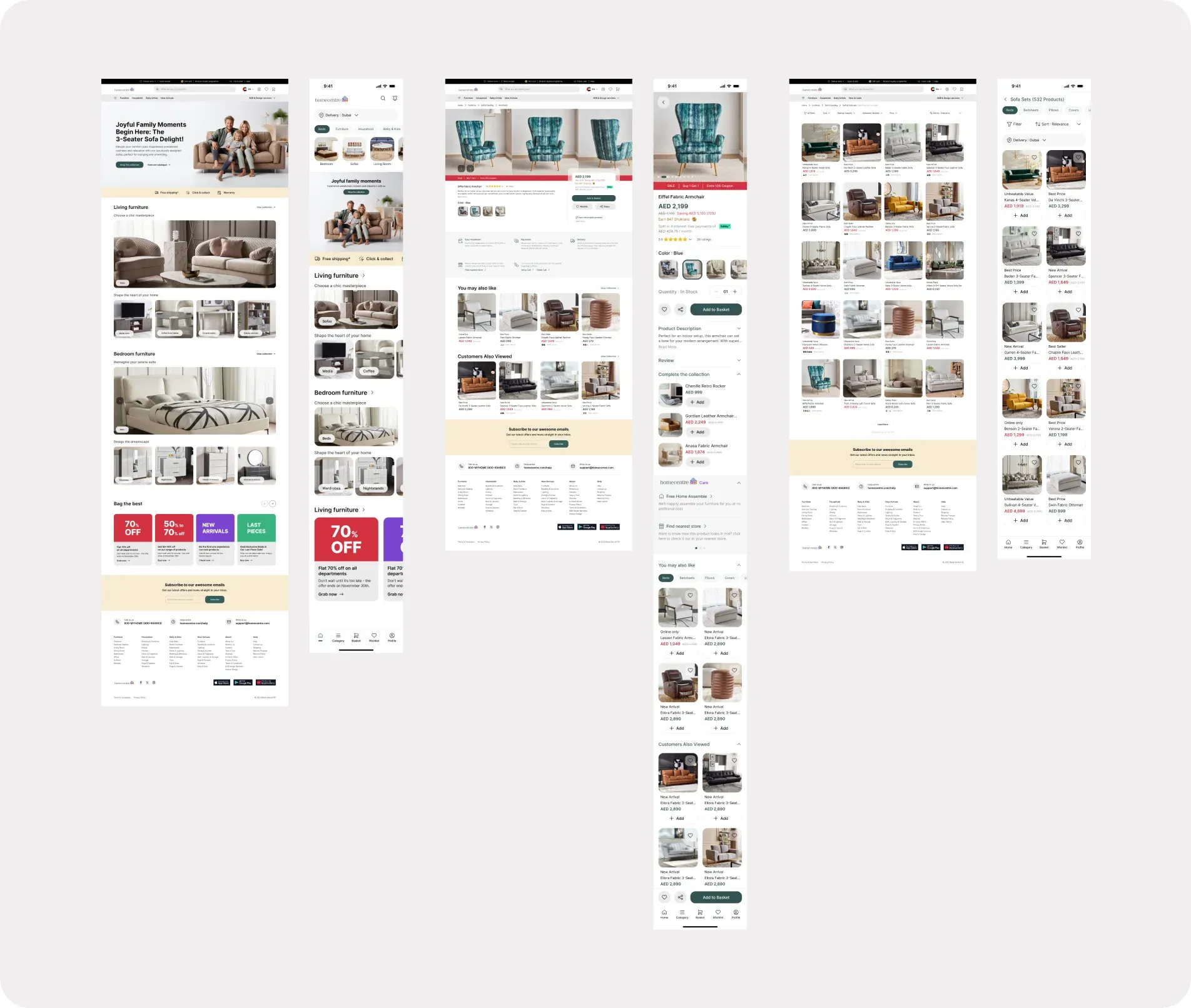
Note: Components are built with styles, instances, variants, and properties. It eliminates the
chances of inconsistencies in design across platforms. It helps designers and developers
create and maintain scalable, cohesive, and user-friendly UIs by starting with the smallest,
well-defined building blocks and gradually assembling them into a cohesive whole.
4. Conclusion
The idea is to create a systematic and modular design system by combining these atomic elements into larger components or molecules, and then further assembling those molecules into even more complex organisms, ultimately forming complete UI templates and pages.
We can reduce the exploration time for designers without compromising on quality and consistency. It also promotes brand evolution without hassle.
5. Work process
The mind map diagram below illustrates the method that I used to complete this project.
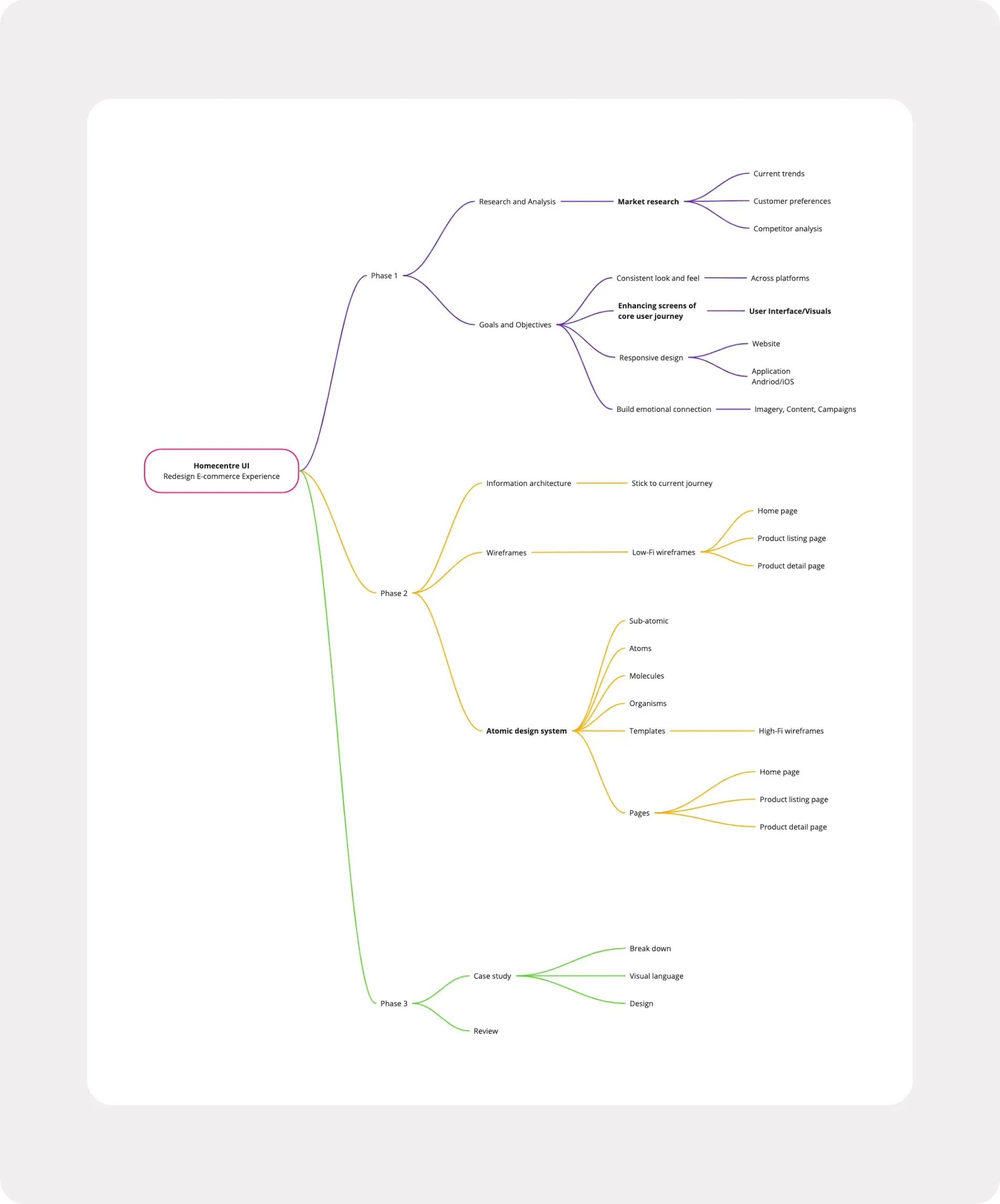
Phase 1: research and analysis (market research into current trends, customer preferences and competitors) and goals and objectives (consistent look and feel, core user journey screens, responsive design, emotional connection). Phase 2: information architecture, low-fi wireframes and the atomic design system, from sub-atomic parts through atoms, molecules, organisms and templates to pages. Phase 3: case study and review.